It was the big moment of the Academy Awards, 2017.
Warren Beatty and Faye Dunaway were set to announce the Oscar winner for Best Picture.
Beatty opened the red envelope and hesitated. He looked unsure.
After 15 seconds of confusion – and a laugh from the audience – he handed the card to the now-impatient Dunaway, who promptly declared the winner: “La La Land”.
The cast and crew, ecstatic, hugged, and took to the stage for the greatest moment of their professional lives.
If by some slim chance you don’t know what happened next, this video may leave you slightly gobsmacked:
What happened?
While producer Jordan Horowitz and co were giving their acceptance speeches, accountant Brian Cullinan, responsible for handing out the envelopes, had realised the mistake. The actual Best Picture winner was Moonlight, not La La Land, but he had accidentally given Beatty the envelope for Best Actress, previously awarded to Emma Stone for La La Land.
Some two minutes into the speeches, officials started scurrying about the stage, trying to convey the news to the unlucky victims of the error.
The mistake was then corrected live on air, with Moonlight ultimately receiving the award, amid a great deal of confusion and embarrassment.
How did it happen?
There were two steps leading to the fiasco.
One: The wrong envelope was handed to the presenters. A rare mistake, but far from inconceivable.
Two: Typography…
Here’s the analysis from Tim Harford (who unpacks this story in episode three of his excellent podcast Cautionary Tales):
“The card that Beatty took out of the envelope had nine words on it, and the largest word was ‘Oscars’.
(Really? is that really the most important piece of information? Are we worried that without it, Warren Beatty’s going to think he’s at the Iowa State Fair handing out a medallion for the best hog?)
The words ‘La, La Land’ and ‘Emma Stone’ are printed with equal weight, even though the winner is Emma Stone. The rest is detail.
Meanwhile, the important words ‘Best Actress’ are tucked away at the bottom of the card, and they’re tiny.*
If best Actress had been prominent, Warren Beatty wouldn’t have been confused. He would have known that he had the wrong card in his hand. And if Emma Stone had been in larger type than La La Land, Faye Dunaway wouldn’t have blurted out the name of the wrong film.
It would have been awkward for Beatty and Dunaway to walk off stage to get the right envelope, but not nearly as awkward as not walking off stage to get the right envelope.”
*You can see just how tiny the category is on the ‘correct’ card as held up during the chaos:

Prioritise Key Information
It’s a salutary lesson for us marketers. The most important information should be the most prominent.
And it isn’t always.
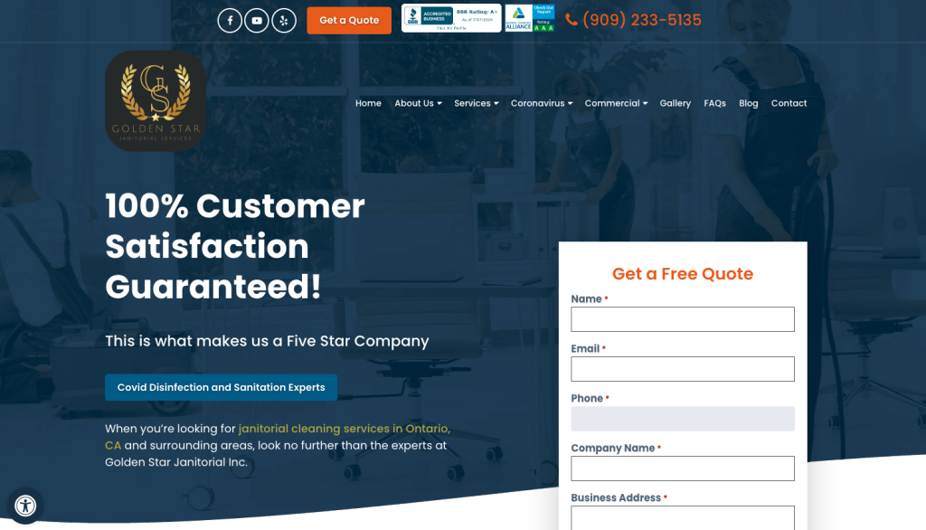
Take this landing page:

If it isn’t obvious (which it isn’t) it’s for a business offering commercial cleaning / janitorial services.
While the question Warren Beatty needed his card to answer – unambiguously – was, which film won the award for Best Picture? The primary questions your landing page should answer are:
1 Who are these people?
2 What’s their offer?
3 Why should I be persuaded by it?
4 How do I proceed with it?
The only truly prominent text on this landing page is ‘100% Customer Satisfaction Guaranteed’.
It’s an attempt to answer question 3 (in a very generic way…) but you’ll have to search high and low to answer the more fundamental questions, 1 and 2 – without which question 3 won’t even be asked…
This is an extreme example, but an example of a common issue.
Often it’s question 3 that gets left behind – especially with B2B advertisers using pages for specific services as landing pages (these inner pages tend to be highly descriptive while lacking any real persuasive content).
How do we fix it?
In the first decade of this millennium, no conversation about UX went without mention of the book ‘Don’t Make Me Think’, by Steve Krug.
Appropriately enough, its entire message is encapsulated in its title. Don’t give the user any unnecessary mental work to do, to decode your content or what you want them to do with it. (Like, really, NONE.)
The design of the award card gave Beatty that unnecessary mental work to do, and the result wasn’t pretty.
The design of the landing page above does the same thing.
Don’t ask the user to bring out their spectacles to find the answers to their questions. You need to make those answers unavoidable.
• Clarity of Central Information:
Make sure the landing page clearly communicates who the advertiser is, what exactly they offer, why it’s worth taking up the offer, and how to do so. This ensures visitors immediately understand the value proposition and next steps.
• Simplicity:
Overcomplicating the landing page with unnecessary information only hinders the path we want the user to take. Keeping the design simple and focused on the primary goal ensures better comprehension and engagement.
• Context Matters:
Understand where users are coming from and tailor the landing page accordingly. Where possible, align the prominent text with the user’s search terms, and the ad text they’ve been shown. Also, consider whether visitors are already familiar with the advertiser (or need a proper introduction).
If we pay for traffic to unclear landing pages, we risk a similar fate to the one so dramatically played out in the 2017 Academy Awards (and while it might not be quite as dramatic, it will be equally tragic).
By applying the principles above, we make our landing pages foolproof – and make sure our campaigns win what they deserve, without the wrong message taking the spotlight.


